The Role of Color in Art Therapy: Hues That Heal

Color, Brain, and Body: What Science Suggests

Reds, oranges, and hot pinks often elevate energy and sharpen attention, which can help surface stuck feelings. We pair activating hues with grounding marks, like slow crosshatching, to contain intensity. Which warm hue helps you voice anger safely?

Color, Brain, and Body: What Science Suggests

Blues and greens can support parasympathetic settling, especially when layered transparently. Slow, cool washes invite paced breathing and softening shoulders. Try three breaths while glazing ultramarine over teal. Share whether your breath changed as the color deepened.

Stories in Pigment: Real Moments from the Studio

Maya rejected “red” but embraced “rose,” saying red screamed while rose remembered. She painted tiny rose circles around a heavy charcoal knot. The knot softened. Language mattered as much as pigment. Which color name makes a difficult feeling gentler for you?

Stories in Pigment: Real Moments from the Studio

A veteran layered Prussian blue over midnight indigo, describing how the weight matched his sleepless nights. Gradually, he scratched silver highlights like moon breaks. He reported fewer nightmares that week. Share a time a deep blue felt like company, not isolation.

Color-Centered Exercises You Can Try Today

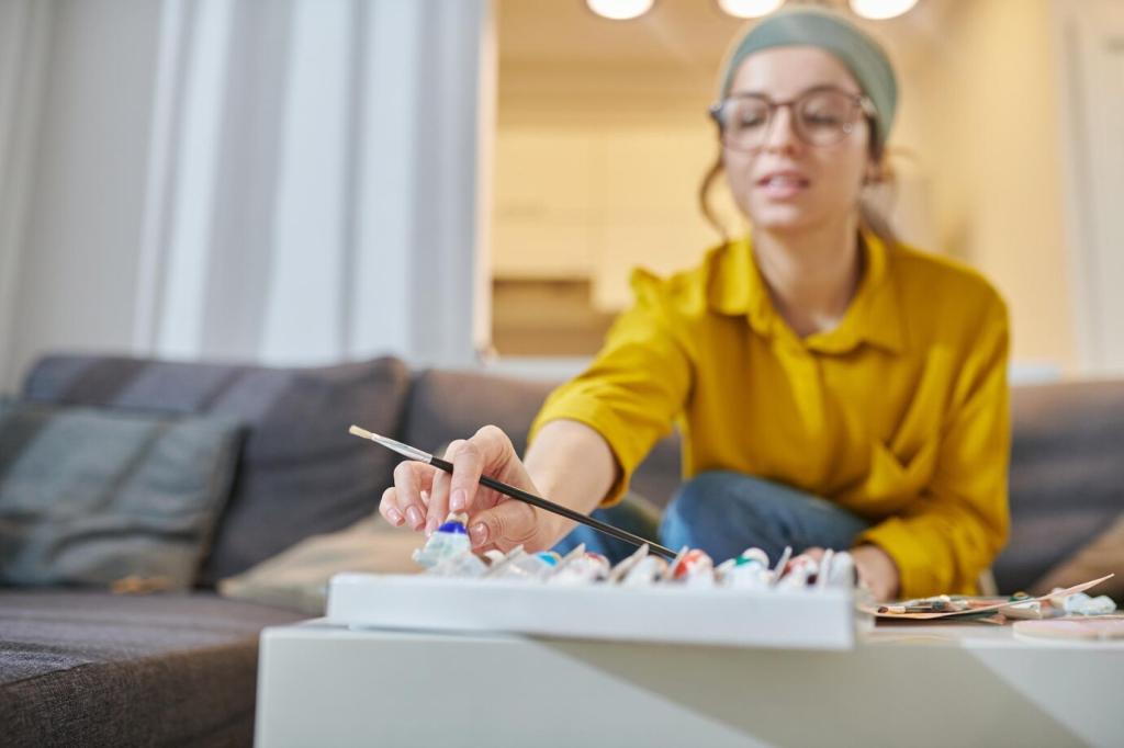
Choose one color and explore its family: light tints, dark shades, saturated cores. Notice when you feel pulled closer or farther. Add one word per swatch. Post a photo of your page and a sentence about what surprised you most.

Meaning Matters: Personal and Cultural Color Contexts

“Blue is sad” and “yellow is happy” erase nuance and context. In practice, blue can be safe harbor; yellow can be glare. We ask, not assume. Tell us a time your color meaning defied the cliché and opened a richer conversation.

Meaning Matters: Personal and Cultural Color Contexts

Create a living glossary: pick five colors and write three associations each—memories, places, sensations. Revisit monthly and note shifts. This becomes a compass for sessions. Share one surprising association you discovered, and how it changed your choice of materials.

Materials, Mediums, and How Color Behaves

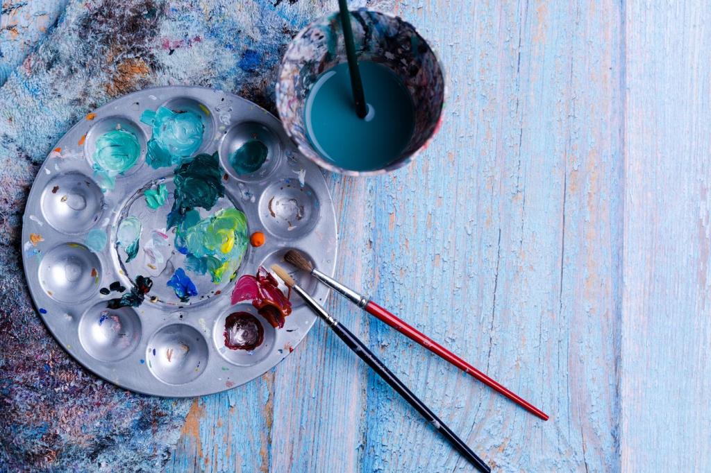
Watercolors layer like feelings—one wash influences the next. Let drips wander, then corral them with pencil, modeling containment. Notice how veils invite gentleness. Post a note on whether transparency felt vulnerable, freeing, or both during your experiment.

Materials, Mediums, and How Color Behaves

Oil pastels reward pressure with brighter saturation, making intensity visible and adjustable. Try pressing hard, then soft, and compare breath rate. What pressure met your moment best? Share a snapshot of your gradients and the mood each band carried.

Designing a Color-Safe Creative Space

Natural light and soft, neutral walls keep colors honest and soothing. Limit visual clutter so strong hues can breathe. What single adjustment—lamp warmth, curtain color, or wall sample—made your space calmer? Share a quick before-and-after impression.

Designing a Color-Safe Creative Space

Offer tinted overlays, matte paper, and non-glare palettes for light-sensitive users. Provide color-limited trays to reduce overwhelm. Which accommodations help you stay present with color? Add your strategies to crowdsource a compassionate resource list.
Petit-school
Privacy Overview

This website uses cookies so that we can provide you with the best user experience possible. Cookie information is stored in your browser and performs functions such as recognising you when you return to our website and helping our team to understand which sections of the website you find most interesting and useful.